How To Create Customizable And Responsive UI Components Using Tailwind

I am a Software Developer.
I love and write about Web Development, HTML/CSS, JavaScript, WordPress & Technical writing.
Many companies and individuals, including startups and solopreneurs, use UI components to create the front end of their websites and apps. These components help them communicate their ideas, convert potential customers into actual ones, and connect with their audience. The UI components must be customizable, responsive, and visually captivating.
Most developers, chiefly front-end and full-stack developers, often struggle to build such UI components. This results in the creation of inflexible and unresponsive UI components.
In this article, you will learn how to create customizable and responsive UI components which are flexible, adaptable, and visually appealing using Tailwind CSS. After that, you will learn how to test the responsiveness of the components on multiple devices and different screen sizes using Chrome Dev Tools, LambdaTest, and Tailwind Play.
"Tailwind CSS is a utility-first CSS framework packed with classes like
flex,pt-4,text-centerandrotate-90that can be composed to build any design directly in your markup." (Source: Tailwind)
Pre-requisites
To follow along in this article, you need to know of:
Let's get started!
What are Tailwind Components?
Tailwind Components are UI Templates and Components or widgets built using utility classes provided by the Tailwind CSS framework. These classes enable developers to smoothly and rapidly create unique UI elements that are highly customizable.
You can create the components in your preferred Text Editor, such as VS Code, Sublime Text, Atom, or in the Tailwind playground.
Examples of Tailwind components include
Profile cards
Site headers and footers
Pricing pages
Hero sections
Buttons
Pricing tables
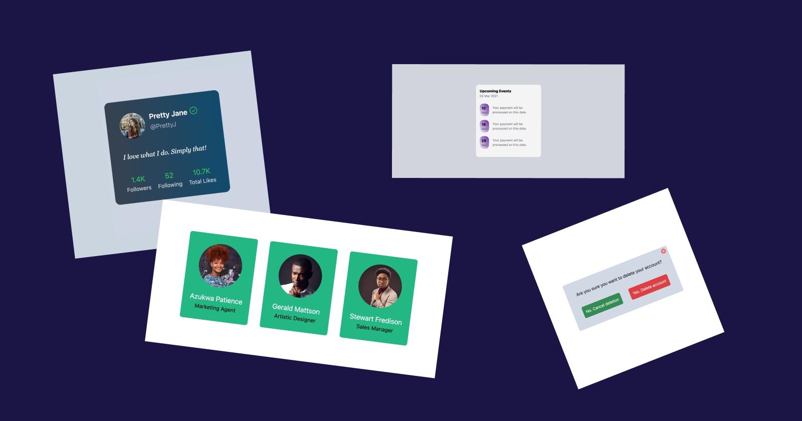
When you use Tailwind CSS classes to create customizable, reusable, and responsive UI elements, they qualify as Tailwind components.
Creating your first Tailwind Component
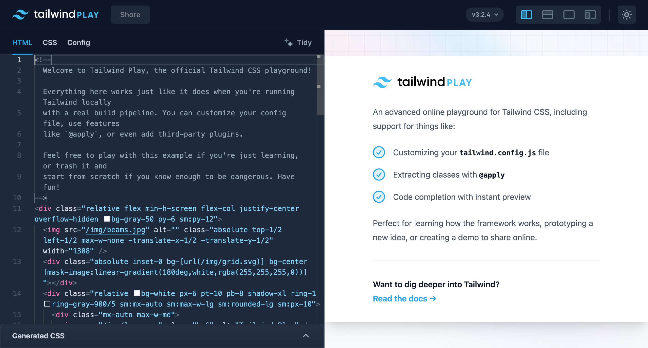
In this tutorial, we shall create a simple, customizable, and responsive site header. For this example, we will use Tailwind's Online Playground, Tailwind Play.
"Tailwind Play is an advanced online playground for Tailwind CSS that lets you use all of Tailwind’s build-time features directly in the browser." (Source: Tailwind blog)
It has coding and preview area sections. You can also choose which Tailwind version you want to use while coding.
You will familiarize yourself with the Tailwind Playground as we build the component. If you haven't tried Tailwind yet, you will get a first-hand look at how Tailwind CSS works without any prior installations in your projects.
We shall use icons from Hero icons created by the makers of Tailwind CSS.
Getting started with the playground
Follow the 3 steps below to get started with the Playground
Step-1:
Go to your browser and visit https://play.tailwindcss.com
The image below shows how the playground looks like
Step-2:
Highlight and delete the code in the editor.
Step-3:
We can now write our code. Let's get started with our component.
Alright, let's start working on our component.
We aim for our component to look like this once it's done ↓
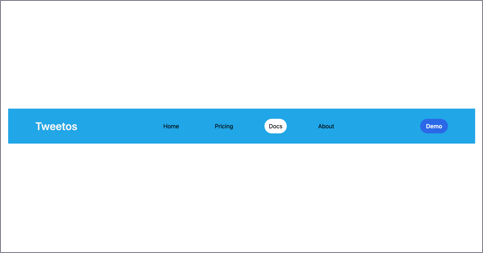
Creating the component
A simple responsive site header
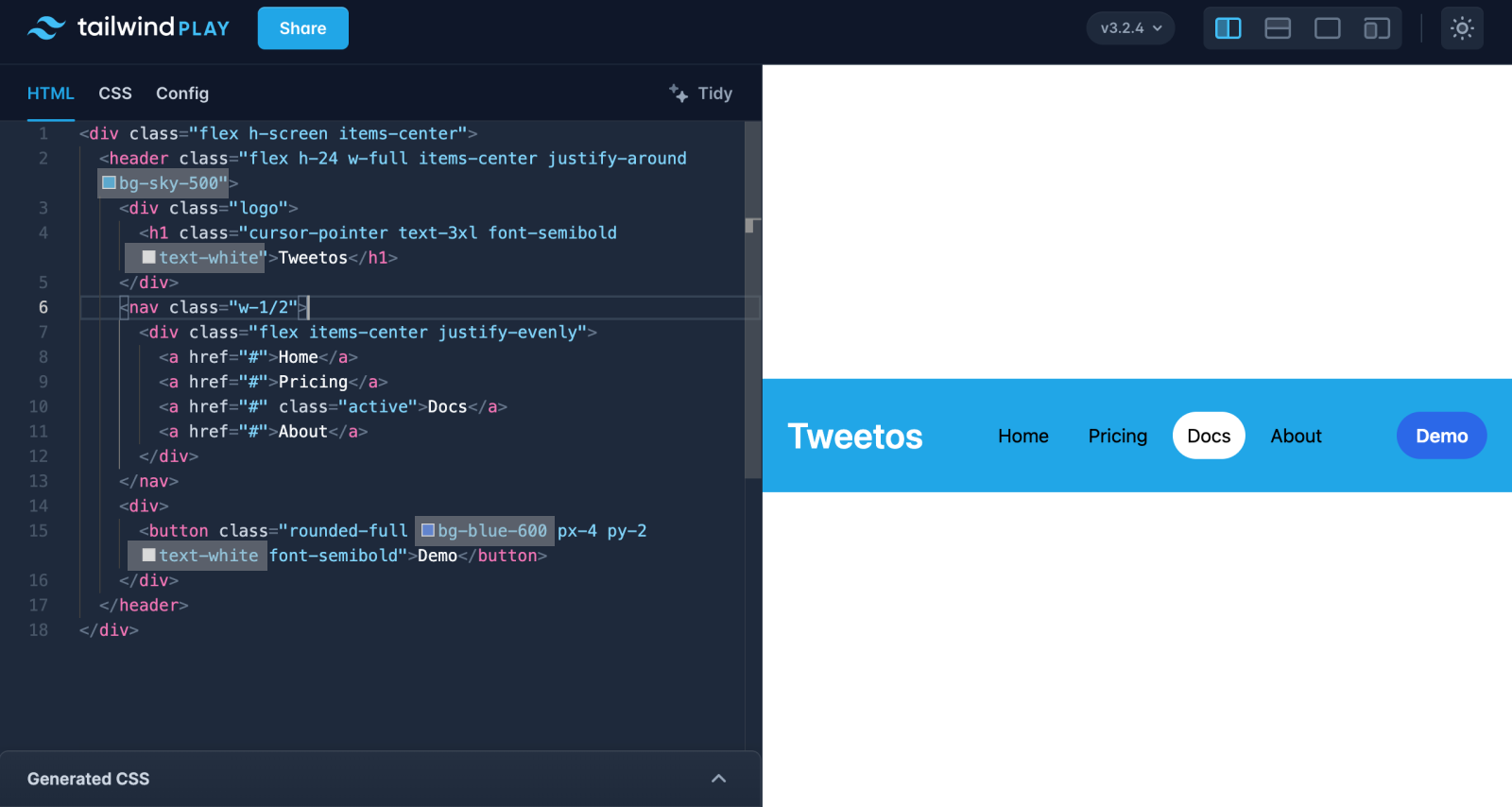
Enter the markup of the component in your editor.
<div class="flex h-screen items-center">
  <header class="flex h-24 w-full items-center justify-around bg-sky-500">
    <div class="logo">
      <h1 class="cursor-pointer text-3xl font-semibold text-gray-100">Tweetos</h1>
    </div>
    <nav class="w-1/2">
      <div class="flex items-center justify-evenly">
        <a href="#">Home</a>
        <a href="#">Pricing</a>
        <a href="#" class="active">Docs</a>
        <a href="#">About</a>
      </div>
    </nav>
    <div>
      <button class="rounded-full bg-blue-600 px-4 py-2 text-white font-semibold">Demo</button>
    </div>
  </header>
</div>
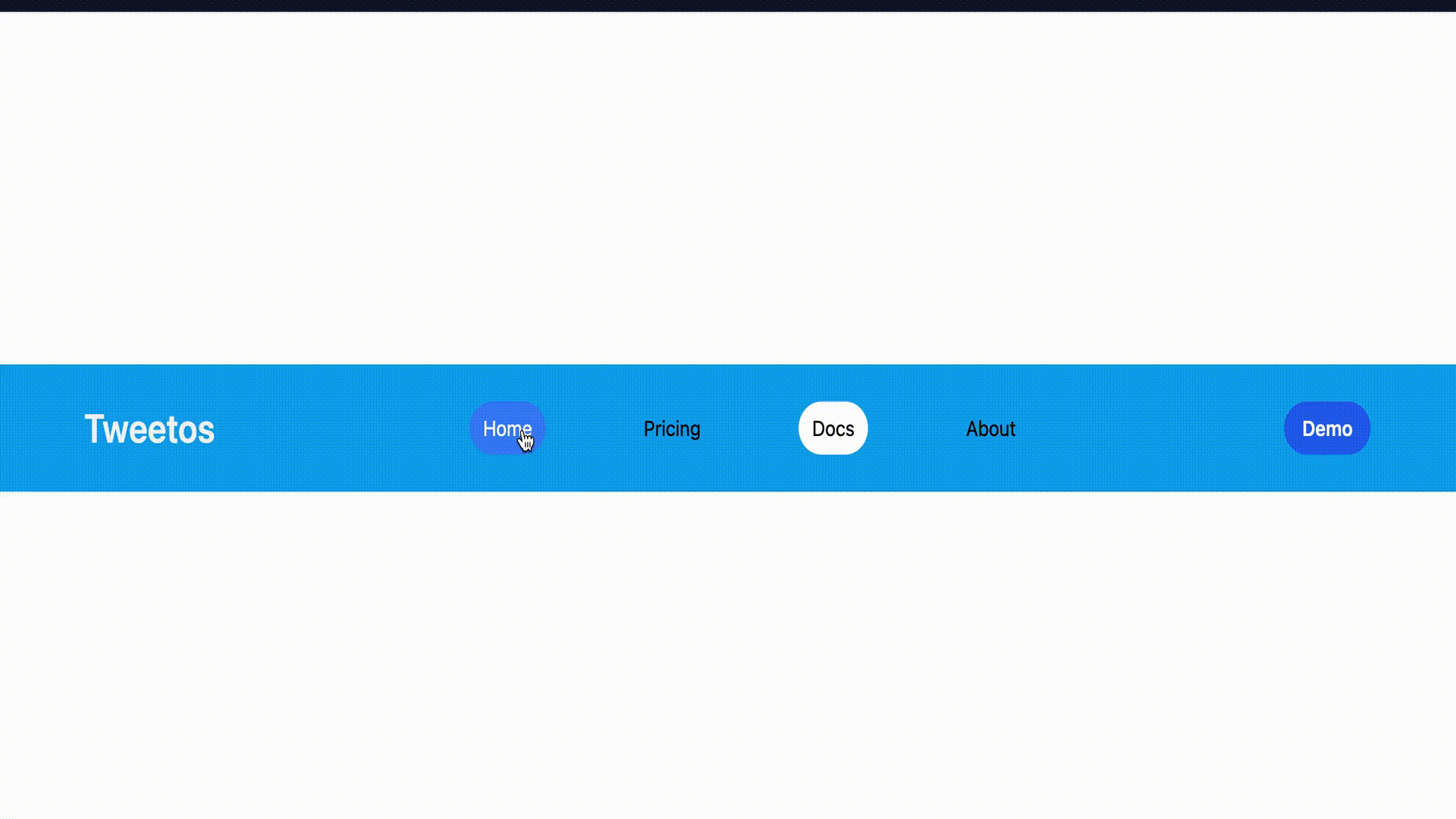
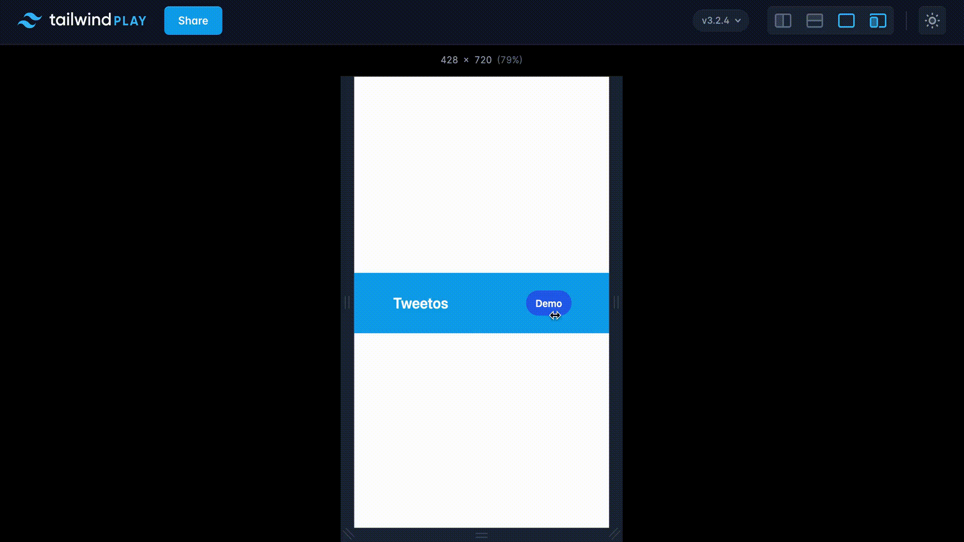
Below is how the component looks and behaves after you enter the above markup in the editor.
Our site header is progressing nicely! Let's add some active and hover classes to the pages to make them more interactive.
Go to the CSS tab and add these classes for the anchor tags and active class.
@tailwind base;
@tailwind components;
@tailwind utilities;

@layer components {
  .active {
    @apply px-3 py-2 rounded-full bg-white hover:bg-none;
  }
  a {
    @apply [&:not(.active)]:hover:bg-blue-500 px-3 py-2 rounded-full [&:not(.active)]:hover:text-white;
  }
}
Alright, so far so good! The next step is to make the component both responsive, and customizable.
How To Make Your Component Customizable And Responsive
To make your component customizable and responsive, you need to understand what these terms mean.
Let's find out.
Making Your Component Customizable
To make your component customizable, you need to build it in a way that allows developers or companies to modify and tailor it to their specific needs and preferences.
Creating it in a customizable manner needs you to define its global or theme settings. We shall use the font and color settings for this tutorial. These are the defaults to change to fit a specific theme or brand settings.
Follow the steps below to define the theme settings of your component
Step-1:
Head to the Config tab. There you will see where to set up your theme settings.
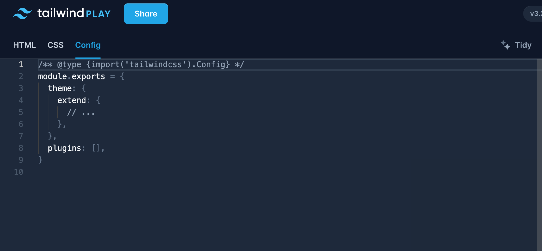
Step-2:
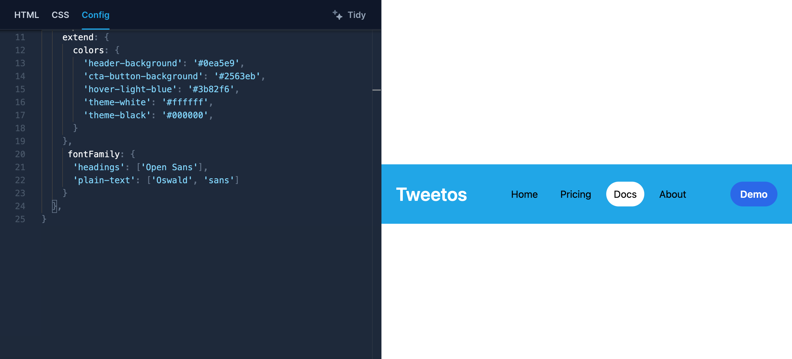
Set up the theme settings for your component. In this case, color and font defaults.
/** @type {import('tailwindcss').Config} */
module.exports = {
  theme: {
    extend: {
      colors: {
        'header-background': '#0ea5e9',
        'cta-button-background': '#2563eb',
        'hover-light-blue': '#3b82f6',
        'theme-white': '#ffffff',
        'theme-black': '#000000',
      }
    },
     fontFamily: {
      'headings': ['Open Sans'],
      'plain-text': ['Oswald', 'sans']
    }
  },
}
Note:
When you set up your custom colors inside the extend object, you can use both them and Tailwind's provided colors. Otherwise, you can only work with the colors you have set up.
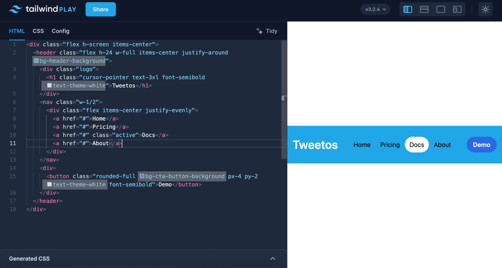
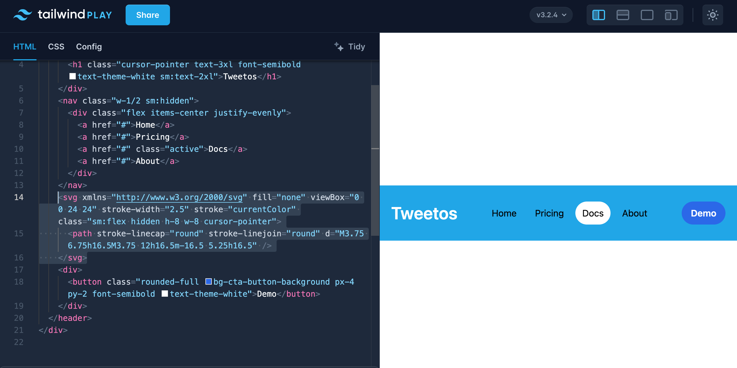
Now, change your colors and fonts in the markup and replace them with what you set in your Config file.
Tailwind colors to replace
Replacing Tailwind colors with our defined theme colors
Time to change the fonts, too. Tailwind provides three font families by default and these are sans-serif, serif, and monospaced.
Now time to work on the fonts. Change the fonts of the logo, and pages by using the font class to add our defined fonts in theme settings.
Note: We shall continue with Tailwind's default fonts for the rest of the tutorial.
You can now change a font or color in your theme settings, and the effect will apply throughout the component without editing every instance in the markup.
Hooray! You have made your component customizable for anyone who wishes to use it. You can do further customizations than this, like spacing and border-radius.
Making Your Component Responsive
To make your component responsive means that it adapts and looks good on different screen sizes of various devices such as phones, tablets, laptops, and larger monitors.
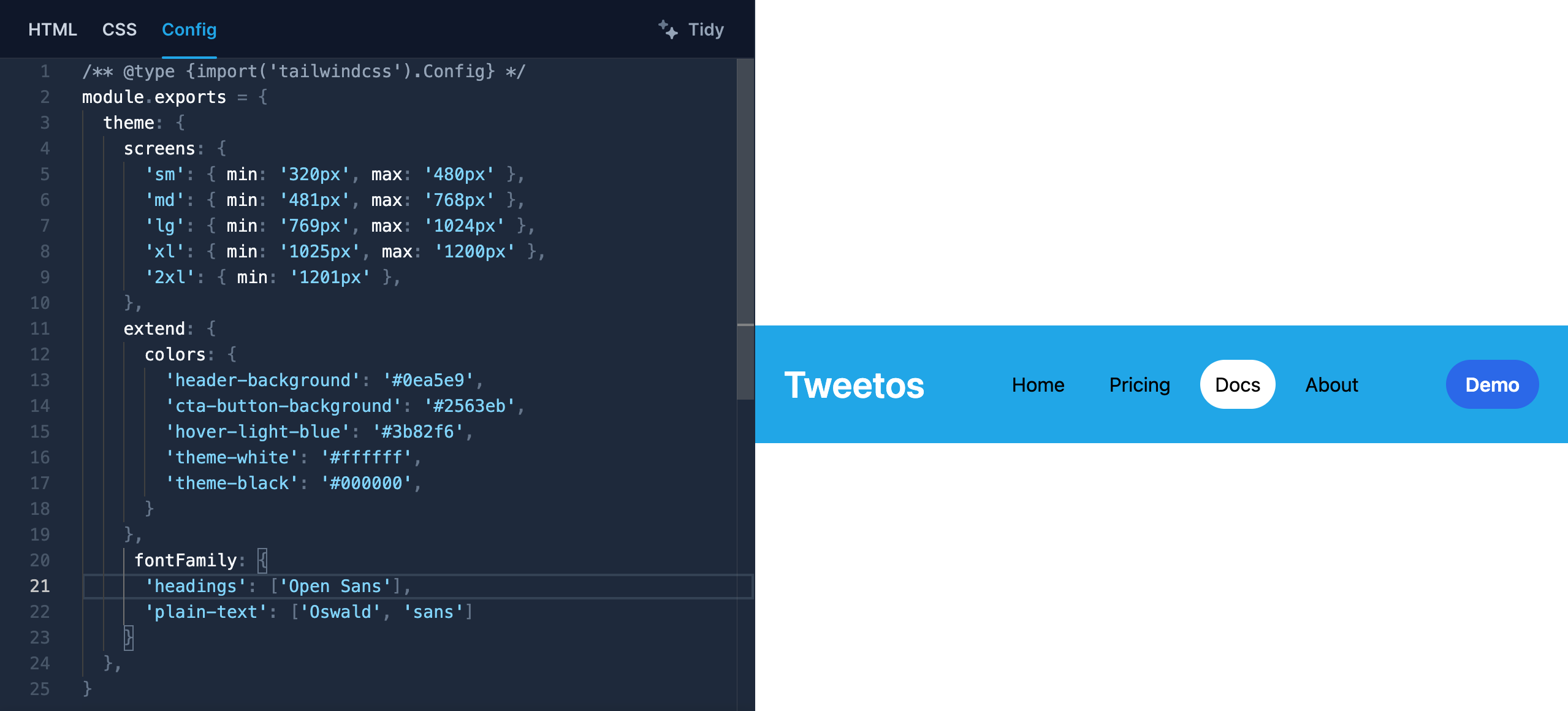
For this example, we are going to make our component responsive based on the familiar device breakpoints below:
Mobile devices: 320px — 480px.
iPads and Tablets: 481px — 768px.
Small screens and laptops: 769px — 1024px.
Desktops and large screens: 1025px — 1200px.
Extra large screens: 1201px, and more.
Go ahead and add the above breakpoints to your theme settings.
/** @type {import('tailwindcss').Config} */
module.exports = {
  theme: {
    screens: {
      'sm': { min: '320px', max: '480px' },
      'md': { min: '481px', max: '768px' },
      'lg': { min: '769px', max: '1024px' },
      'xl': { min: '1025px', max: '1200px' },
      '2xl': { min: '1201px' },
    },
    extend: {
      colors: {
        'header-background': '#0ea5e9',
        'cta-button-background': '#2563eb',
        'hover-light-blue': '#3b82f6',
        'theme-white': '#ffffff',
        'theme-black': '#000000',
      }
    },
     fontFamily: {
      'headings': ['Open Sans'],
      'plain-text': ['Oswald', 'sans']
    }
  },
}
You now need to make your component responsive based on the breakpoints in your theme settings.
<div class="flex h-screen items-center">
  <header class="flex h-24 w-full items-center justify-around bg-header-background">
    <div class="logo">
      <h1 class="sm:text-2xl cursor-pointer text-3xl font-semibold text-theme-white">Tweetos</h1>
    </div>
    <nav class="sm:hidden w-1/2">
      <div class="flex items-center justify-evenly">
        <a href="#">Home</a>
        <a href="#">Pricing</a>
        <a href="#" class="active">Docs</a>
        <a href="#">About</a>
      </div>
    </nav>
    <div>
      <button class="rounded-full bg-cta-button-background px-4 py-2 font-semibold text-theme-white">Demo</button>
    </div>
  </header>
</div>
Test the component's responsiveness.
Make the component look awesome by using a hamburger menu for smaller screen sizes, as the menu for larger screens won't work.
Let's add a hamburger menu to the HTML markup. Follow the steps below to get going:
Visit Hero icons
Search for a bars-3 menu icon
Copy the SVG code
Paste the SVG between the nav tag and the cta-button div
After that, add the following classes to the SVG
<svg xmlns="http://www.w3.org/2000/svg" fill="none" viewBox="0 0 24 24" stroke-width="2.5" stroke="currentColor" class="sm:flex hidden h-8 w-8 cursor-pointer">
      <path stroke-linecap="round" stroke-linejoin="round" d="M3.75 6.75h16.5M3.75 12h16.5m-16.5 5.25h16.5" />
</svg>
Test the component's responsiveness again
Kudos! on making your component both customizable and responsive. One thing is remaining now, testing the responsiveness of the UI element on different devices with varying screen sizes to ensure its responsiveness.
Let's see how we can do responsive testing for the component.
How To Test The Responsiveness Of Your Component
After you create your Tailwind component, you need to test its responsiveness on different screen sizes. Below are some of the tools you can use for the job.
Tools:
Tailwind Playground
LambdaTest
Chrome Dev Tools
Let's see how you can use each of them.
Responsive Testing In Tailwind Playground
You can test the responsiveness of your component first in the Playground where you created it. It provides a feature for checking the responsiveness of UI elements or components created within it.
To get started, follow the steps below:
- Click the icon in the upper right corner, which is on the left of the light/dark mode icon.
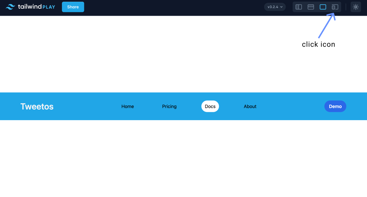
Drag your component's window and see how it responds to different screen sizes as defined in your config file.
You can now see its responsiveness in the playground as you adjust the screen size.

You have successfully tested your component's responsiveness using the playground.
You can modify your UI element for better reaction to the screen sizes as you see fit.
Responsive Testing Your Component Using Lambdatest
LambdaTest is an online cross-browser testing tool where you can perform manual and automated tests on multiple devices, browsers, and operating systems.
We are going to use its responsive testing LT Browser 2.0. The LT Browser is a
"next-gen browser to build, test & debug mobile websites." (Source: LambdaTest)
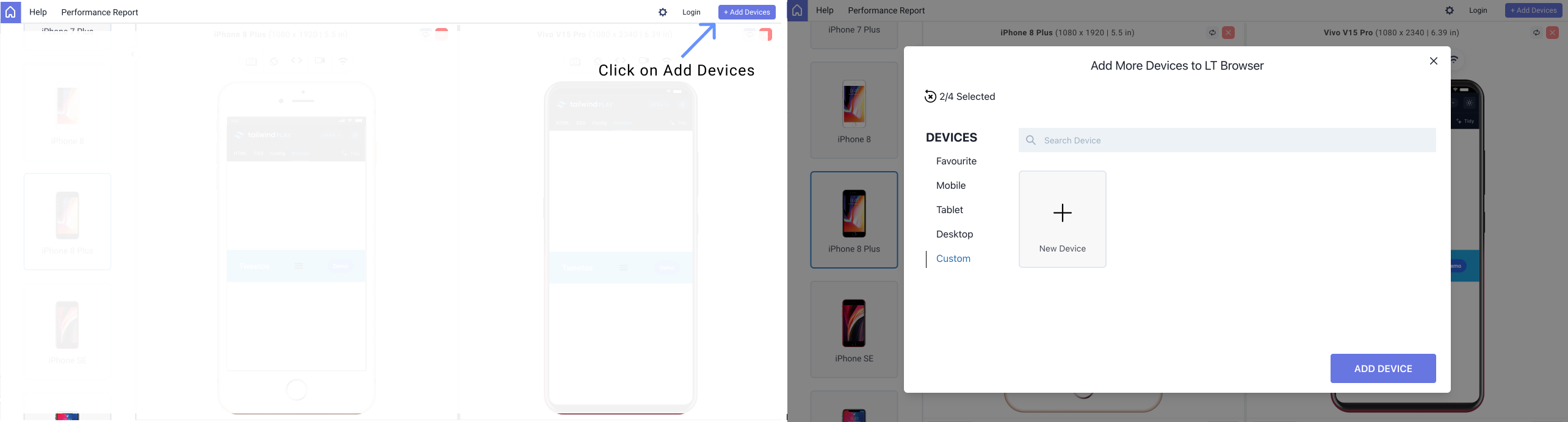
To do this, head over to LamdaTest. After that, follow the below steps to get started with the testing:
Install the LT Browser on your machine
Launch the browser
Enter the URL of your Tailwind Component in the address bar
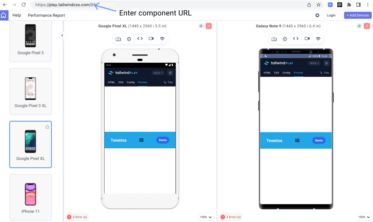
Start testing on any of the available devices of your choice
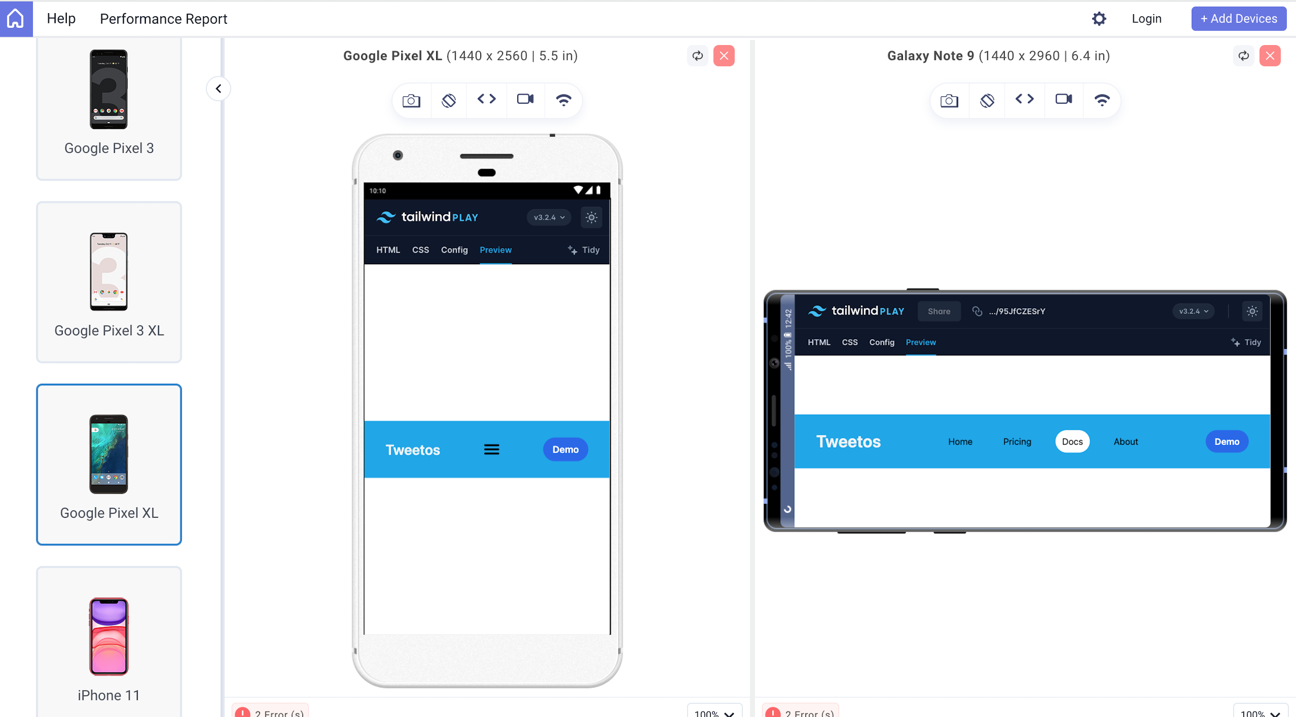
Do testing on different tablet devices
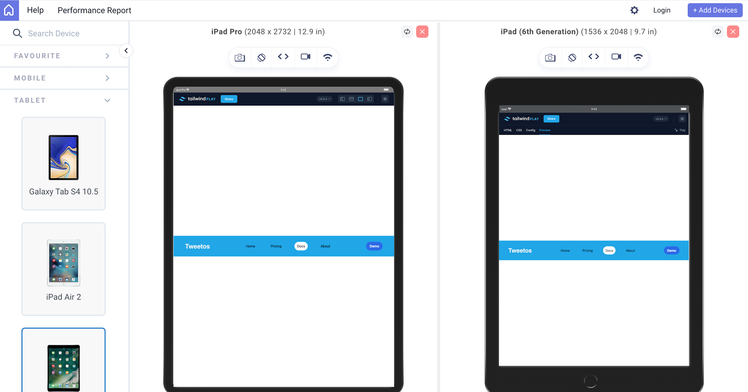
Do testing on various desktop devices
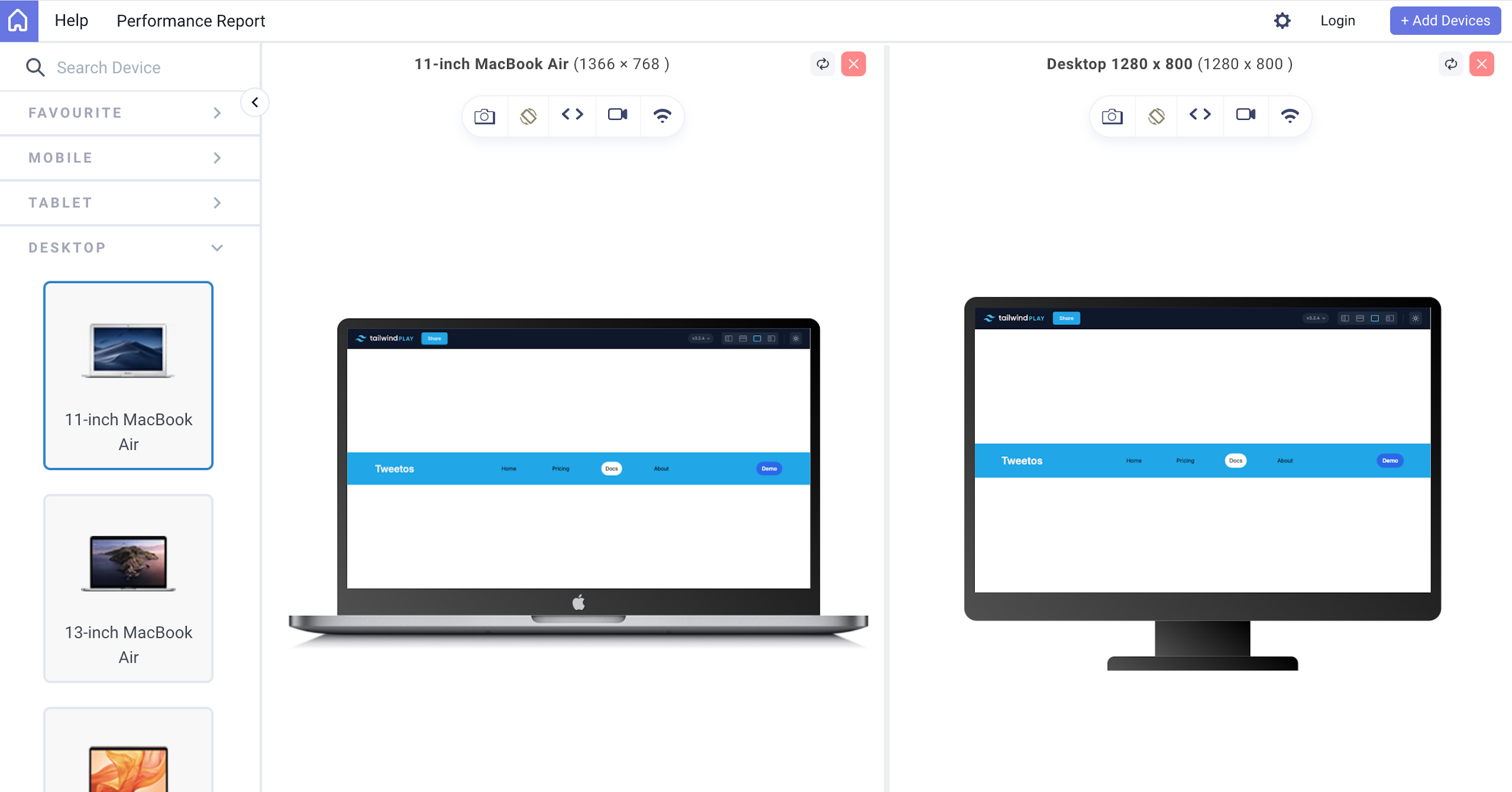
Choose a device of your choice on which you wish to test your component, or add a custom one.
The LT Browser avails you with a couple of features. You can also generate a performance report.
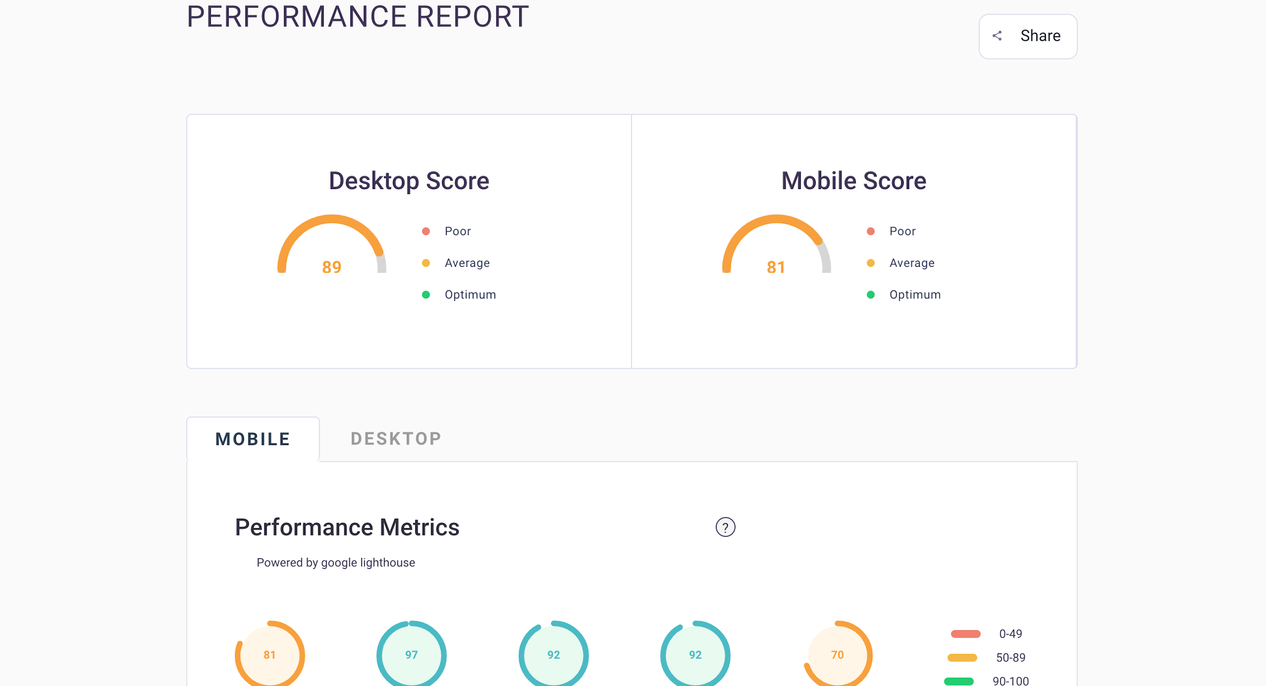
You can check out more on LambdaTest here.
Responsive Testing Your Component Using Chrome Dev Tools
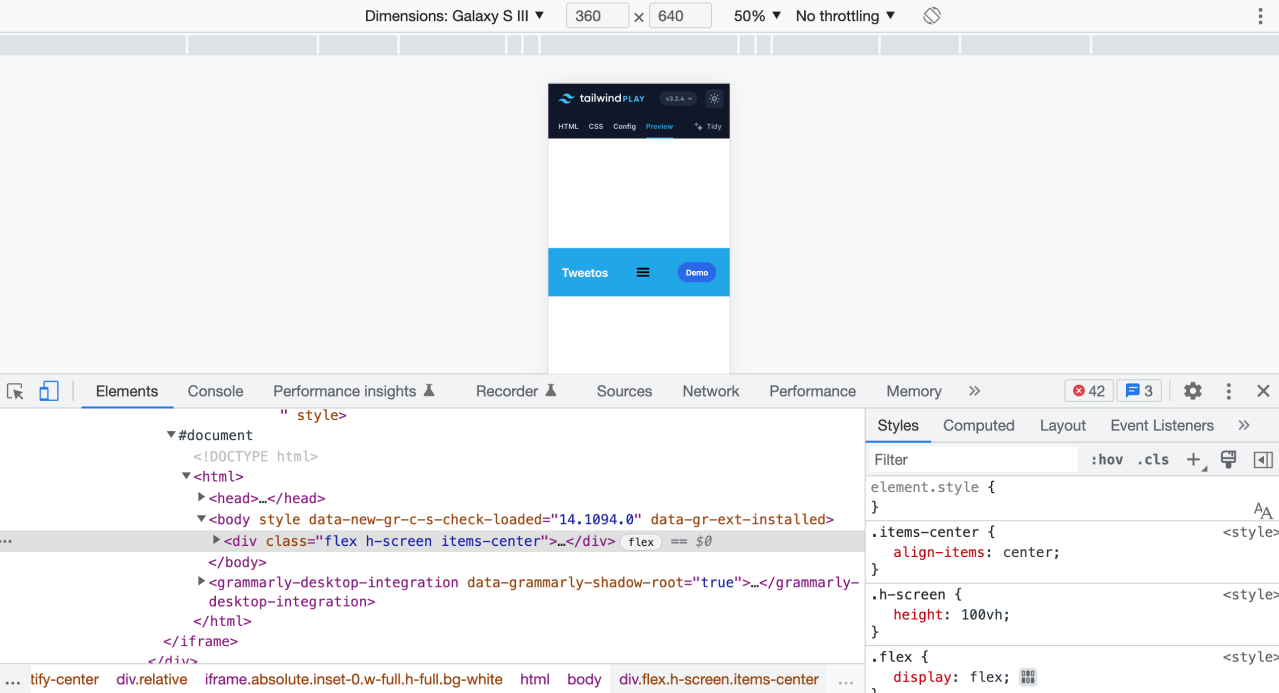
To check your component's responsiveness on different screen sizes and various devices using Chrome Dev tools, follow the below-mentioned steps.
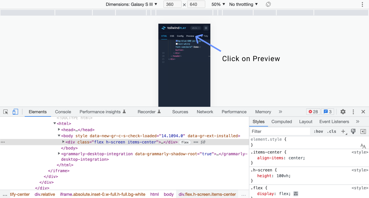
Right-click on the page, and click inspect.
Click on Preview on the component window
Click the drop-down arrow at the top of your window.
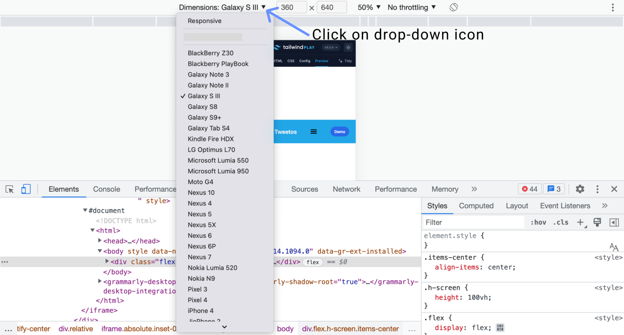
Here you can either choose Responsive or choose a device that you may wish to test your component's responsiveness on.
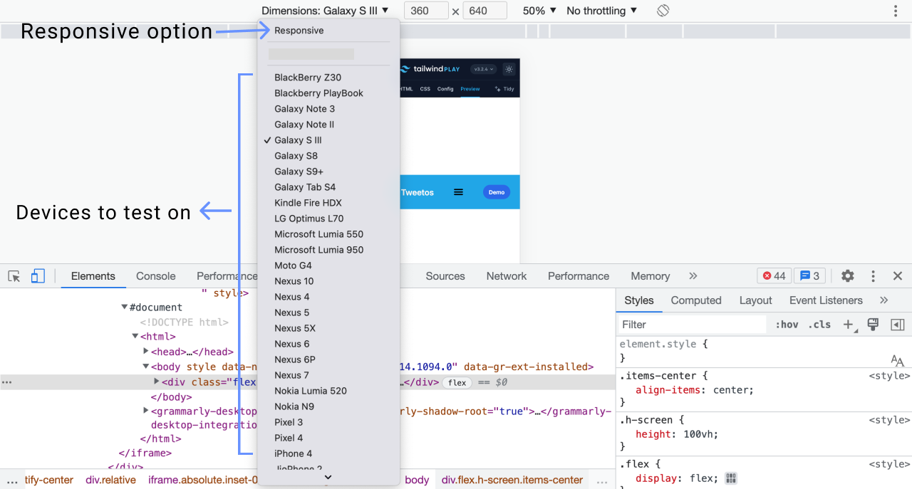
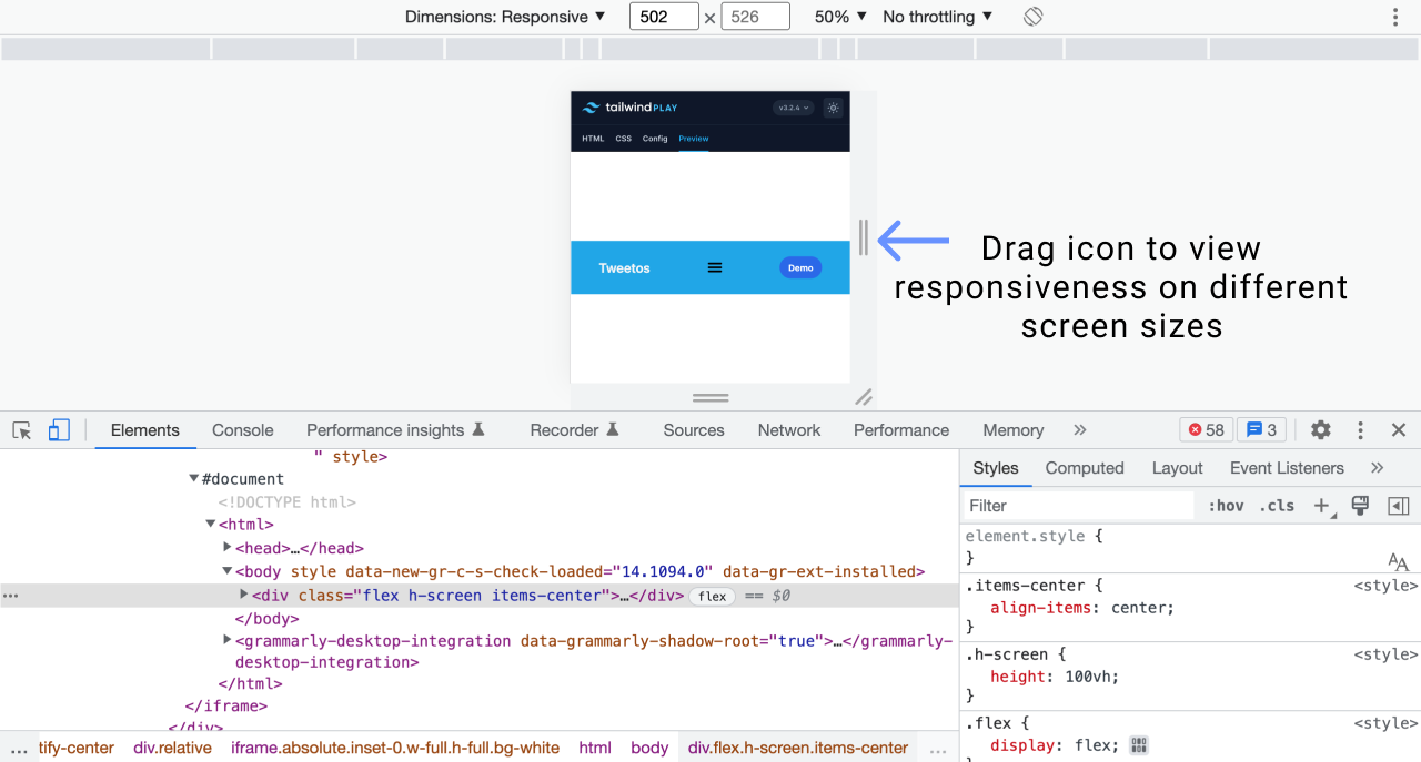
Responsive option
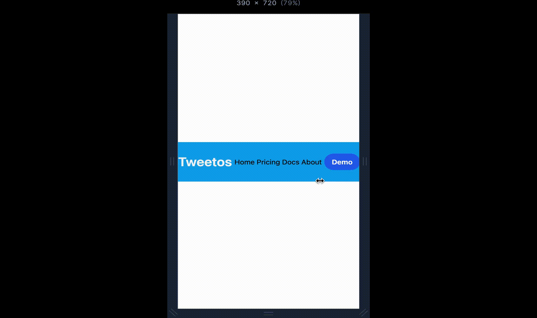
When you choose the responsive option, you will be able to view the response of your component to different screen sizes by resizing the window.
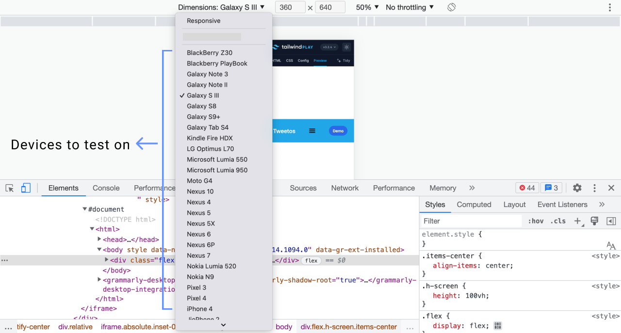
Devices option
You can decide to test your component's responsiveness on any of the available devices.
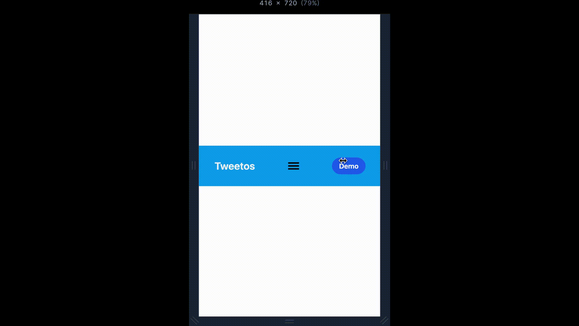
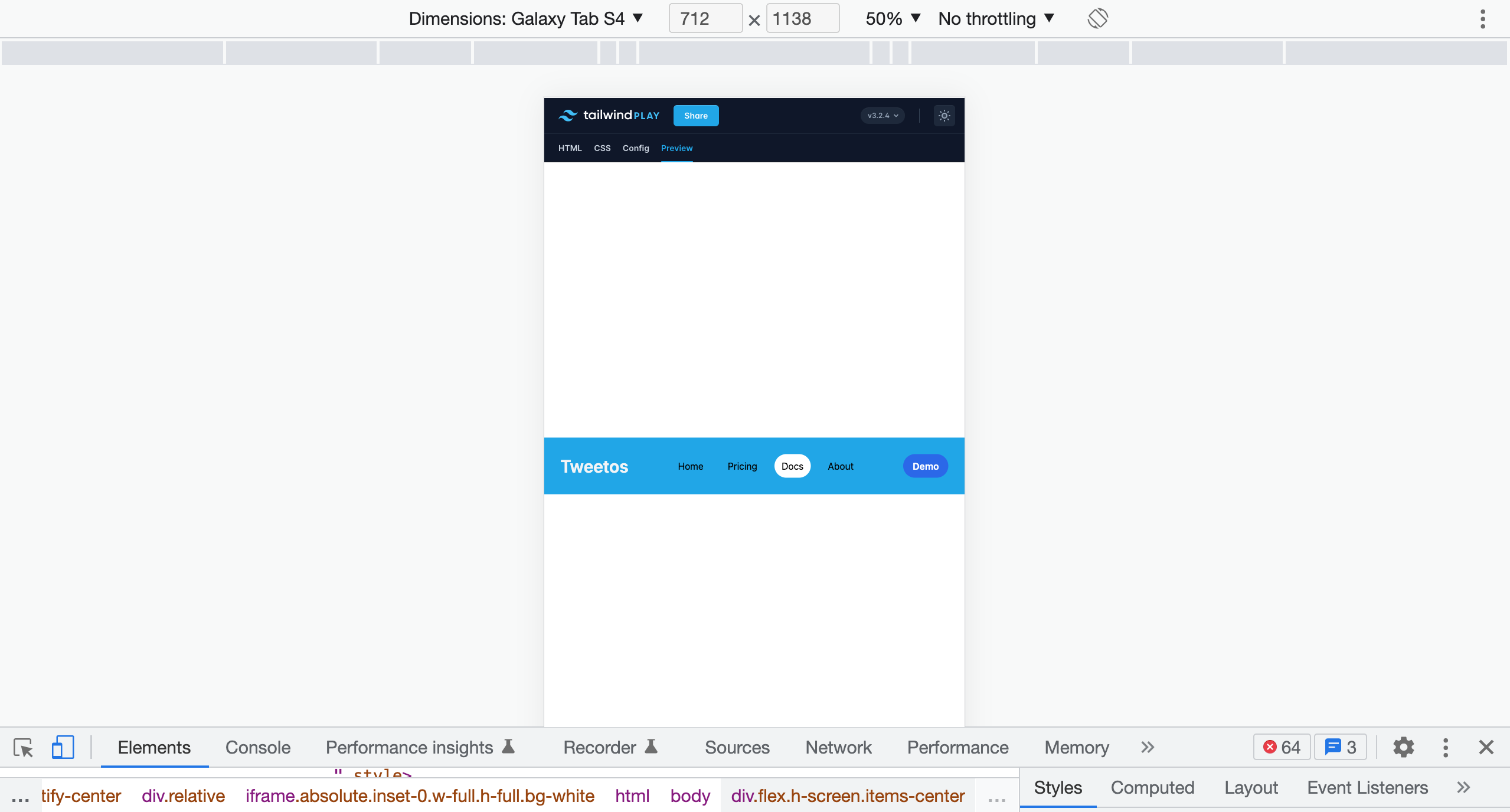
If you choose Galaxy Tab S4, for example, your component will look as shown in the image below on that device.
If there is a particular device on which you wish to test your component's responsiveness and it isn't available, you can add it there.
Follow the below steps to add your custom device
Click on the drop-down arrow for devices
Choose the last option of Edit
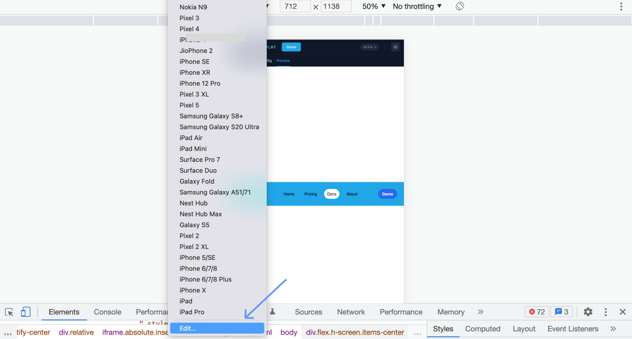
Click on Add Custom Device. Enter the device name and dimensions.
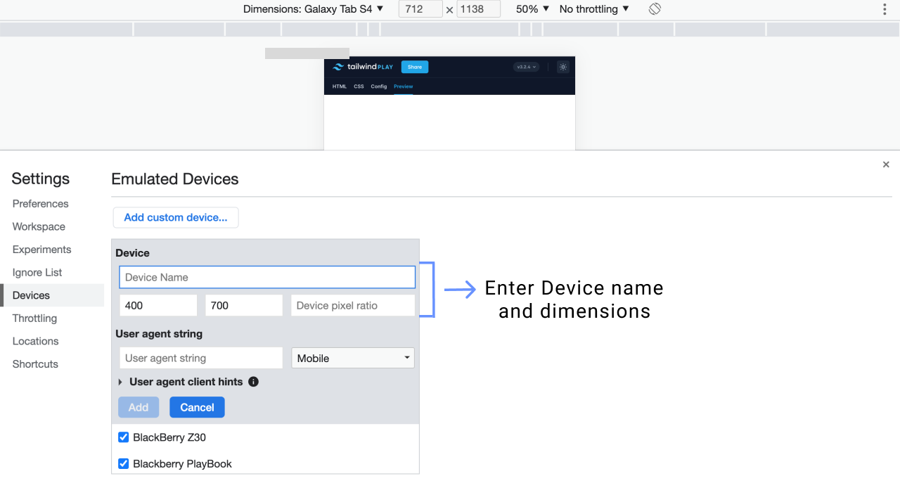
You can now start responsive testing your component on the custom device you have just added to the Dev Tools.
Tests help you know how your component responds to different devices of various screen sizes, so you can easily decide how to resolve any issues found.
Here is the link to the component we have just created: Visit component.
Feel free to tweak things up 😉
How To Get Component Ideas
Get ideas from design inspiration websites
Visit UI inspiration websites such as Dribble, Behance, and Awwwards to get component ideas to create.
UI/UX designers provide the public with free UI designs for use and inspiration through these websites. Some of the designs include landing pages, login forms, signup forms, and pricing tables.
Giving You Inspiration
Below are some Tailwind Components I have created. Feel free to check them out, play with them, and add or remove something. Have fun 😊
I share them with you in the hopes that they inspire you to create your first Tailwind Component.
Take a look, take inspiration. ↓
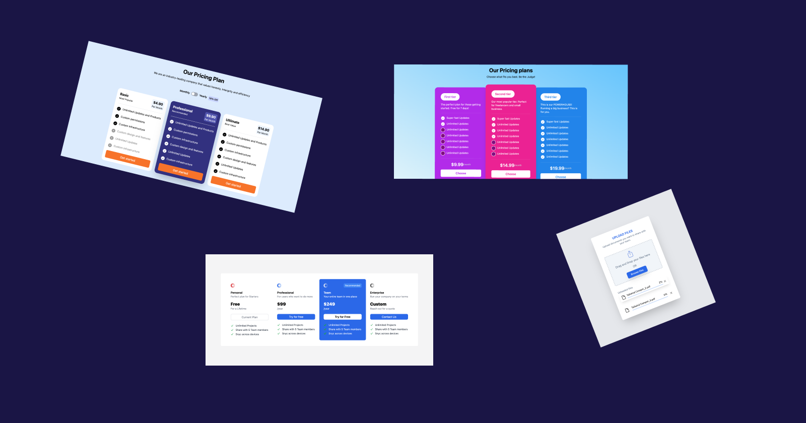
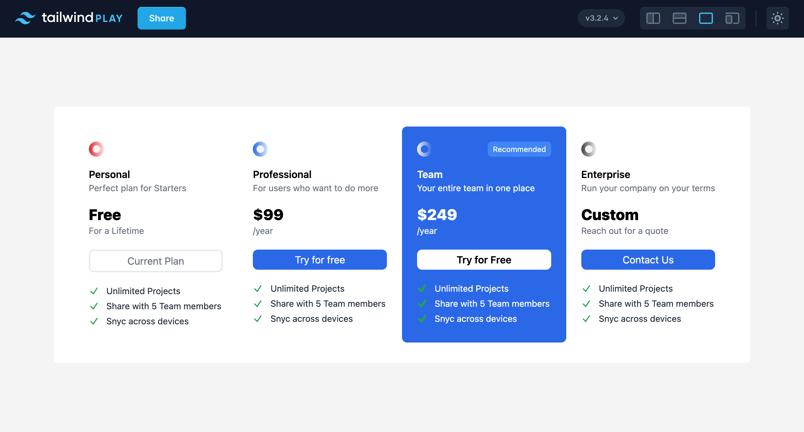
Pricing Table
Visit Pricing table
Pricing page
Visit
Pricing page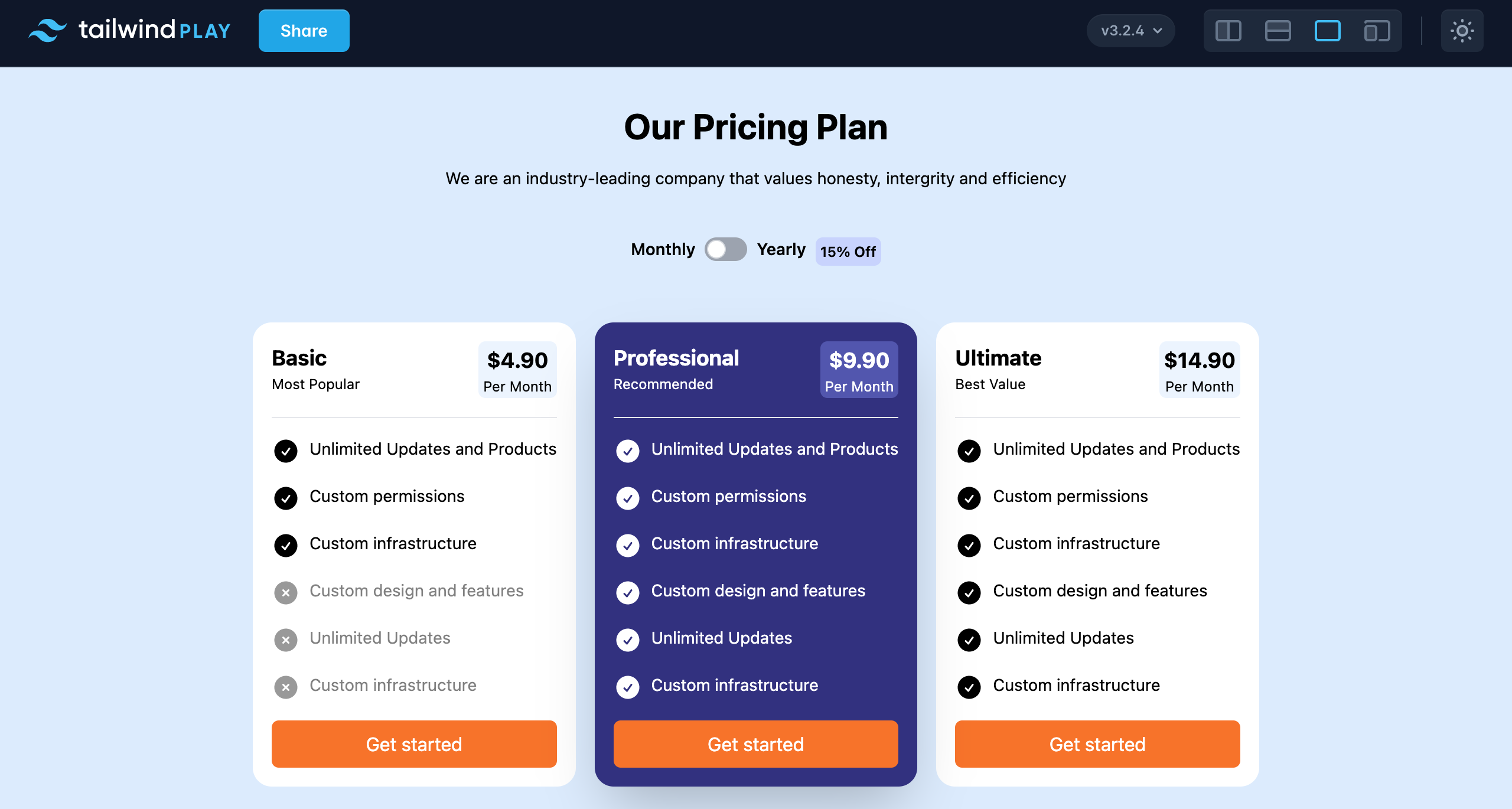
If you find the components fascinating and would like to explore more for your learning and practice, check out this GitHub Repository that contains additional components I created. Use them to learn and practice while creating widgets or putting your Tailwind knowledge to practice.
Conclusion
You have learned how to create customizable and responsive UI components using Tailwind CSS. Now, I suggest you go try out creating your first Tailwind component. I promise you are going to enjoy it.
Happy coding. Happy learning!


